Our logo
August 28, 2020
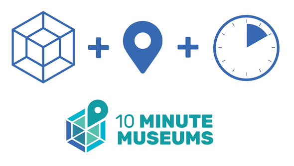
We built the 10 Minute Museums project logo out of the combination of three symbols:
- a tesseract, a “box” with four dimensions that packs many surprises when you play with it;
- a map location pin, because a 10 Minute Museum is a place worth finding and visiting;
- the 60-degree angle that represents 10 minutes in a clock face.
The tesseract seen from the front is similar to a web, a network of ideas around a central subject.
The font we used is Rubik, an open-licensed font created by Sebastian Fischer and Philipp Hubert for an exhibition about Rubik’s cube. Its letters neatly fit on squares, which reflects the modular construction of a 10 Minute Museum. It’s practical and straightforward, but with friendly rounded corners.
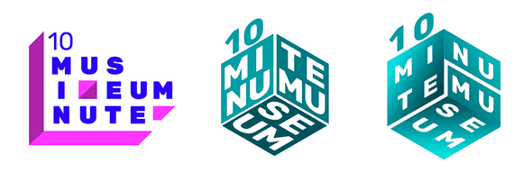
Our first drafts tried playing with the name and the idea of a short visit to the museum. We tried the Hilbert curve, a more straightforward loop, and a snake path, but legibility was a problem, as was the idea of a very linear experience.
These next ideas played with adding an extra dimension and less linearity. We were pleased with the concepts visually, but they were still too hard to read.
Representing the shape of a 10 Minute Museum as a cube, although it added an extra dimension, was still too reductive. The hypercube concept came out of this search for a simple shape that could hold a world of possibilities within.
For our final logo, we changed the word Museum to plural, so each 10 Minute Museum identifies itself as part of a hopefully worldwide network. Together with our 10 Minute Museum Construction Kit, we’re going to provide a free license so you can use our logo and announce your creation here.


